- Home
- China Guide
- Culture
- Chinese Architecture
- Architectural Styles in Beijing
Marvel Modern Architecture in Beijing

There are thousands of historic buildings in Beijing, a city with over 3000 years of history, and the cityscape is changing with each passing day. As the memory and historical legacy of a city, the Forbidden City, the Great Wall, and the quadrangle dwellings are all a pretty treasure. But what really depicts the city’s overall image is the modern architecture. A lot of novel buildings are in the streets of Beijing, such as, for example, the National Stadium which is crisscrossed with gray steel girders interlocking upwards and inwards to make a mash-shape “Bird Nest”. It is a highly visual impact. Located to the west of the Great Hall of the People and Tiananmen Square, the National Theater of Beijing looks like a silvery elliptical “egg” in the surrounding waters. These are just the tip of the iceberg of architecture in Beijing. This article introduces modern Beijing architecture from styles and forms to materials since 1949, and you will see how times have shaped the architectural styles and how buildings record the times and remain in the city.
Stalinist architecture
In the early days of China’s foundation, buildings – as other fields – were influenced by the Soviet Union. The Stalinist architecture was prevalent during the 40s and 50s in China, which was marked by the “three sections – base, middle section, and eaves. During this period, a great many of buildings in Beijing adopted this design.
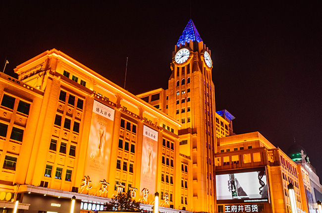
Beijing Department Store (1955)
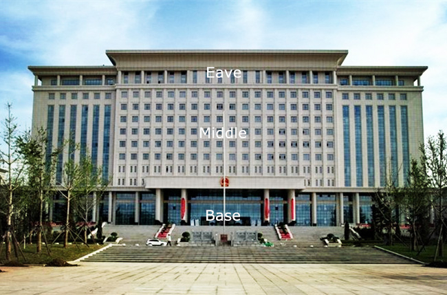
Former Beijing Municipal Government Building (1956)
Another feature is a layout based on strict symmetry, a combination of the high-rise main building and lower wings both sides. This construction had a profound influence on public architecture design in Beijing. As for the landmarks of Stalinist architecture, it adopted a stepped shape, which is like a giant wedding cake standing in the city. The buildings consisted of a higher central tower with a pointed tip, usually crowned by Soviet star. In the 1950s, it was very common in Beijing’s iconic buildings.
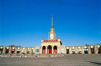
Beijing Exhibition Center(1954)
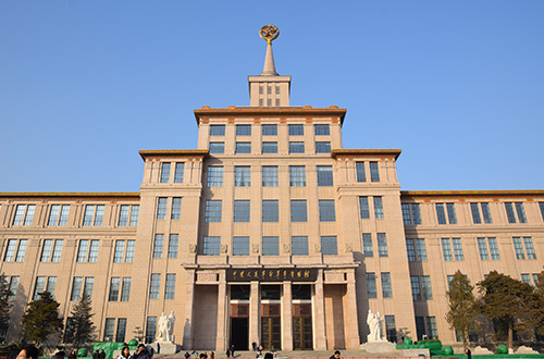
Military Museum (1956)
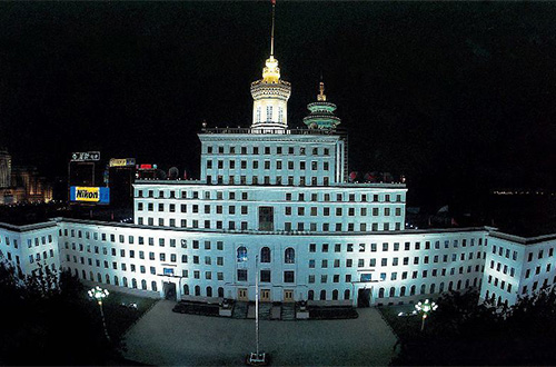
National Radio and Television Administration Building (1956)
Nationalist Style
Chinese Overhanging Eaves
To pursuit the “nationalist style”, a lot of designers combined the overhanging eave with modern buildings, but this design had not disappeared since the 1950s, even though it was criticized as “dressed in a suit with a Chinese hat”. After a half-century, it reached its peak in the 90s. The difference is that the large roofs were not directly adopted the ancient forms, but the simplified modern version.
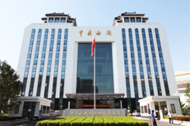
China Customs(1949)
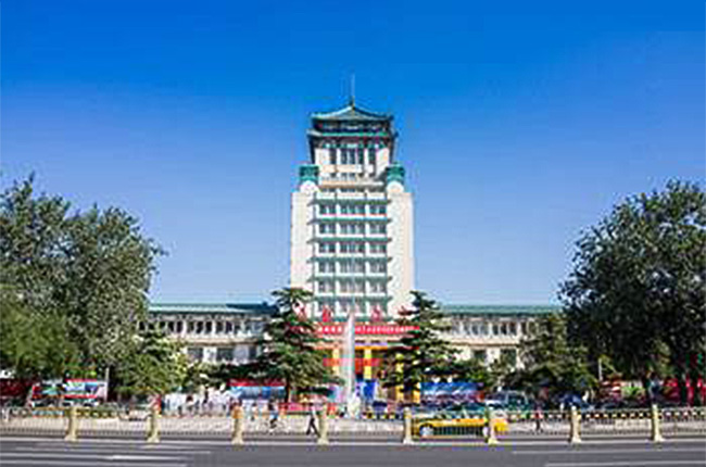
Cultural Palace of Nationalities(1959)
Simple Ornament
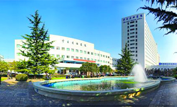 China-Japan Friendship Hospital (1983)
Unlike ornate and retro Stalinist Style architecture, the nationalist style limited with technique and economic condition, a great number of buildings in Beijing of the 1950s to 1980s were very simple and plain, just brick and cement wall or dry wall without any decoration.
The Trend of Ceramic Tile
Chinese factories started to mass-produce ceramic tiles by purchasing technology. The Chinese who began to get rich were eager to decorate their buildings. The ceramic tile as a rare choice was popular in Beijing and throughout the whole country.
Horizontal Lines
As the frame structure gradually substituted the brick and concrete structure, it had become the mainstream structural form of public buildings. The facade of Beijing’s buildings turned to be changeable and the ribbon window appeared in modern architecture on the street.
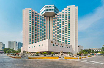 Xiyuan Hotel (1984)
The Jagged Façade and Streamline
The building with a jagged facade is not very common, but it is unforgettable. In the 80s, over 10 or 20 stories begun to common, which used streamline on the façade to enhance the towering performance.
Rooftop Restaurant
Since the reform and opening up, hotels had been the new type that developed vigorously. The top floors of many buildings were designed as the rooftop restaurants. Xiyuan Hotel was the first to build a rooftop restaurant in 1984.
Curtain Wall
Great Wall Hotel is the first Sino-foreign joint venture hotel with five-star in Beijing. The whole building is decorated with a glass curtain wall, which is very eye-catching. Since then, the curtain wall became popular. The original curtain wall had a visible metal frame, seems to be a little clumsy. In the late 80s, the tinted glass had risen to prominence, it was chosen by people who pursue fashion. However, people quickly found that the tinted window make the interior dim. The trend didn’t last long.
Inverted Big Roof
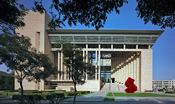 National Science Library(2006)
Some construction was designed by the third party in the 90s; there was a half among of those architects from Hong Kong and Taiwan. The inverted trapezoid roof was created by them in their early period works. After that, the inverted big roof kept growing and became one of the typical types of the new Chinese style.
Minimalist with Postmodernism Style
Enter in the new century, a lot of Beijing construction turn to be simple and pure, you almost only can find the neatly arranged rectangle on the façade. To avoid too much plain, architects precisely design staggering figures on the facade.
Elegant details
While the architecture form trend to simple, architect pay more attention to the architectural details and craftsmanship. Today’s curtain wall usually used translucent glass and a slim metal frame to enhance the modernist effect, compared with the massive curtain wall in the early days.
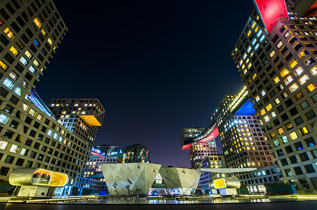
Contemporary MOMA (2008)
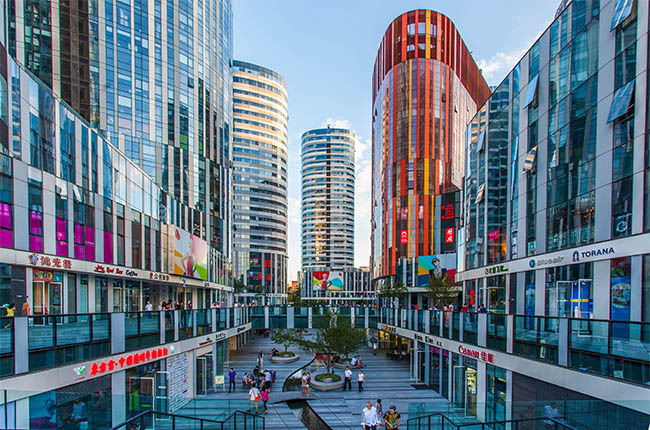
Sanlitun SOHO (2009)
Smooth Curve
Advanced technology makes the skyscrapers taken on a graceful appearance without being too twisted. In recent years, the multi-story buildings have smooth curves in outlines. Close to the building, visitors will observe the chance of light and shadow, closed and open space.
Wangjing SOHO is a complex of three curvilinear asymmetric skyscrapers. Look up to the three-tower project is like the connected three mountains, which unique curved surface present dynamic and gentle aesthetics of architecture. Another example is Galaxy SOHO, its exterior displays the extension of space, visitors can look up or overlook through a space of a hundred meters long. The clever thing is the fluidity and direction of the space.
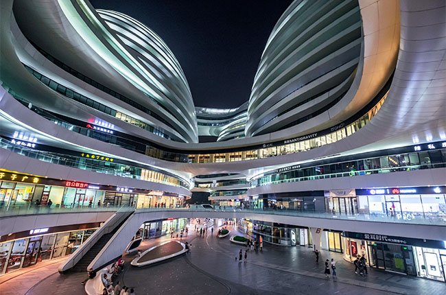
Galaxy SOHO (2012)
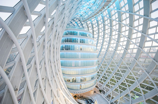
Phoenix International Media Center(2012): the design is inspired by the Mobius strip.
Modern architecture in Beijing is not beautiful enough in today’s perspective, because aesthetics change fast as times develop, but those buildings may use the most fashionable styles and newest materials. Even though some designs leading the era have been criticisms, which still as impressive landmarks in the city.
OR
Are you eager to begin your Chinese cultural journey?
Drop us a line and we will promptly connect you with our leading China expert!